
Martin's Supermarket | south bend, indiana
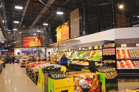
Martin’s Super Market, located in South Bend, Indiana, was inspired by the simplicity and freshness associated with open-air, farmers markets. When designing the space, we took cues from the stripped-down look-and-feel of the stalls one would see when strolling through the market, leaving structural elements exposed making everything feel raw and natural.
Handwritten elements on the signage around Martin’s gives a personal touch while the digital signs make sure that all information is up-to-date and easily swapped out if need be.
It was important to us that we kept the graphics and colors throughout the store bright and colorful, yet simple so as not to distract from the produce and product that was strategically put in places to give the senses the experience of freshness.
By using different floor treatments and structural motifs, a “store-within-a-store” concept for the pharmacy gives the customer a completely different experience than that of the rest of the market. There is also a café on an upper mezzanine level that gives the customer an aerial view of the excitement and energy that is happening down below.
Like all Studio H2G designs, we thought about the customer experience and how Martin’s can differentiate itself from every other grocery store that is transactional-based. What we produced was a place to come and enjoy food and community and be inspired not only to purchase, but to engage with the world around them that we’ve created.


